Airbnb: why a mocked logo and the idea of belonging reset a $30 billion brand
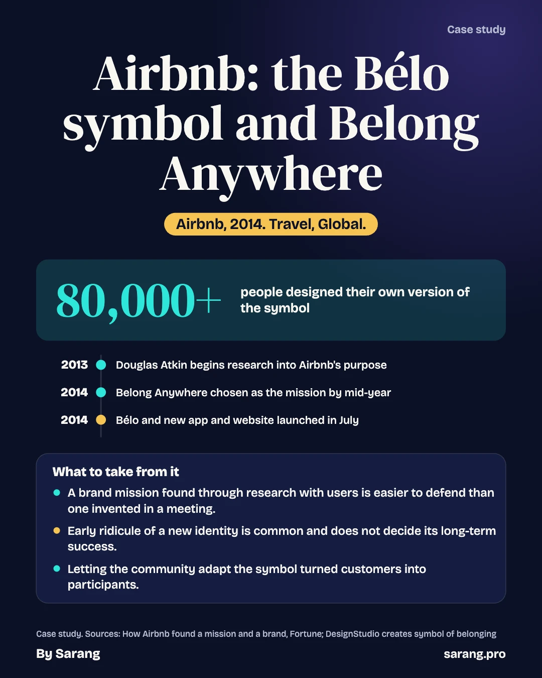
Airbnb's July 2014 Bélo rebrand was mocked within hours, yet 80,000 people drew their own version, and revenue reached $4.8 billion by 2019.
- date of the Bélo rebrand launch
- 16 Jul 2014
- consultancies initially considered; DesignStudio beat nine on the shortlist
- 35
- people interviewed in the mission research
- 480
- people who designed their own version of the logo
- 80,000+
The situation
On the evening of 16 July 2014 Airbnb stopped looking like a start-up. The company switched on a new logo, a new red colour scheme, a new website and new mobile apps, and put a single idea behind all of it: belong anywhere. The logo was a looping line with a point at the top, called the Bélo, and it came with a promise that anyone could draw it. Airbnb’s chief executive, Brian Chesky, explained the thinking with a short line about the difference between a house and a home. A house is a space, he wrote, and a home is where you belong.
The company was nearly seven years old by its own telling, and large. A Fast Company profile from September 2015 said Airbnb had listings in about 32,000 cities, and The Branding Journal, writing a week after the launch, counted more than 34,000 cities in 190 countries. The old identity had been in place since 2008, and Andrew Schapiro, the graphic design lead at Airbnb, told Design Week that it “didn’t capture what Airbnb is”.
The reaction was immediate and, in part, rude. Within hours the internet had compared the Bélo to a paperclip, a bear’s nose, the logo of a software firm called Automation Anywhere, and a number of parts of the human body. A Tumblr blog collecting the jokes appeared within 24 hours, according to The Branding Journal. Dezeen listed the comparisons the next day. Meanwhile the designers and the company carried on with what the new brand was for.
This case is about that rebrand and what followed. The site already has a case on Airbnb’s early days: the air mattresses, the cereal boxes, the photographs. This one starts after the company had become a large marketplace and asks a different question. When a platform that owns no rooms wants people to trust strangers, how much of the work can a symbol and a slogan do?
Background
A short note on the early years
Airbnb began with two roommates, Brian Chesky and Joe Gebbia, renting air mattresses in San Francisco in the autumn of 2007 and joined by Nathan Blecharczyk in 2008. Airbnb’s own newsroom today dates its founding to 2007, while the stock-market filing it made in November 2020 records the company as incorporated in June 2008 under the name AirBed & Breakfast. The earlier case covers that story in detail, so it is not repeated here.
From a tech company to a hospitality company
Fortune’s 2016 long read describes a change of thinking at the top. In late 2012 Chesky read an issue of the Cornell Hospitality Quarterly and concluded that Airbnb should see itself as a hospitality company as much as a technology company. He then recruited Chip Conley, a hotelier and author of the book Peak, in the autumn of 2013 as head of hospitality and strategy. Conley visited 25 cities, set up education and standards for hosts, and started a mentoring programme for them.
The search for a mission
Around 2013 Airbnb had a new global head of community, Douglas Atkin, according to Fortune. Atkin asked why the company existed. His team interviewed 480 employees, guests and hosts. Guests often said they did not want to be “tourists”. Later he spoke to 300 more hosts and guests about what belonging anywhere meant. By mid-2014 the company had settled on belonging as its focus.
That research is the origin of the slogan. It also explains why the rebrand was not just a new coat of paint. The company had spent months finding out what its users thought they were doing, and the answer was closer to joining a place than renting a room.
The marketing chief
Fast Company reported that Jonathan Mildenhall joined as chief marketing officer in early 2014. He came from Coca-Cola North America, where he had been vice president of integrated marketing communications and design excellence. He described his ambition as building a community-driven superbrand. He also described the leadership as a three-legged stool of two designers and an engineer.
The industry
A marketplace with no rooms
Fortune observed in 2016 that Airbnb’s listings outnumbered the rooms of the largest hotel chains, although the company owned none of them. That is the central economic fact of the business. Hotels own buildings and brands; Airbnb owned a brand and a network of hosts. A hotel can guarantee a standard because it controls the room. Airbnb could only encourage a standard, which is why hosting guidance appears in the Fortune account: reply to booking queries within 24 hours, communicate clearly, clean thoroughly.
Trust and the strangers problem
Chesky wrote, as Fortune summarised it, that mass-produced travel had replaced a village-like feel and that people had stopped trusting one another. For a platform asking one person to stay in another person’s home, the brand had to answer a question that no hotel chain faced: why should I trust this stranger? The choice of belonging as the idea was a response to that.
Rivals and the sharing economy
The sources opened for this case name few direct competitors. Social media commenters compared the Bélo with the branding of Couchsurfing, the free home-stay network. PhocusWire said Airbnb was aiming at a fully branded experience for the sharing economy and treated the symbol as something that could exist beyond one company. Elisa Schreiber of the venture firm Greylock told Fortune that “Airbnb is humanity”, setting it against Uber, which she described as transactional.
Regulation
The sources opened say little about regulation in 2014. The earlier case on this site touches on local rules, and this one makes no claims about them.
The decision
Design Week’s account of the project shows what was at stake. Airbnb had an identity from 2008 that no longer matched the company. The founders could redraw it, or they could redefine what the company said it was. The choices can be framed as three routes, although the sources describe only the one that was taken.
Option one: tidy the old logo
A refresh would have kept the existing name and the cyan palette and improved the typography. This route was cheap and low risk. It would also have left the company describing itself as a booking site, at a time when Chesky wanted it to be seen as something closer to hospitality. Schapiro’s remark that the old identity did not capture what Airbnb was suggests why that route was weak.
Option two: a symbol the community owns
The route taken was a mark that users could adapt. DesignStudio’s design came in two forms, according to Design Week: the Bélo, used as the Airbnb identity, and a community symbol that hosts and guests could change. The mark was meant to be simple enough to draw by hand and to apply to stamps, stickers and keyrings, with a platform called Create Airbnb for the purpose. The risk was loss of control. A symbol that anyone can alter will be altered, and some of the alterations will not be welcome.
Option three: replace the name
The sources do not suggest that the company considered dropping the name Airbnb, but the question is a natural one for a business whose name referred to air beds and breakfast, which it no longer sold. Keeping the name meant the new mark had to add the meaning, which is why “belong” and “Airbnb” were tied together in the word Bélo, built from the first four letters of belong, as Mildenhall told Fast Company.
The choice of agency
Airbnb selected DesignStudio, a London consultancy, after a pitch the summer before the launch. It was one of 35 international consultancies initially considered and beat nine others on the shortlist, according to Design Week. For its pitch DesignStudio built an Airbnb listing in its own office. It then set up a studio inside Airbnb’s headquarters in the United States and was given access to the whole company, up to the chief executive.
What they did
Building the identity, 2013 to 2014
James Greenfield, executive creative director at DesignStudio, led the work. A specialist firm, Signsalad, examined the cultural meanings of the pictogram, and the typeface was a version of Circular from the foundry Lineto, according to Design Week. The earlier cyan gave way to a light red that The Branding Journal said was chosen to suggest passion and love without aggression, with a secondary palette of purple and teal named after streets around the world. The mark was to stand for four things: people, places, love and Airbnb itself.
The launch event, 16 July 2014
Airbnb broadcast the launch live from its original San Francisco apartment. Invitations went to community members, and about 13,000 people from 78 countries watched, as PhocusWire reported. Chesky presented the symbol as something that could stand for belonging without being tied to one brand, and the company announced that the community could use it on their own items.
The product change
The rebrand arrived with a redesign of the site and apps. PhocusWire listed a homepage with a community section and a discovery section for destination ideas, listing pages with larger photographs, a revamped neighbourhood guide, a new host interface, real-time calendar availability and a mobile layout with edge-to-edge images. The Branding Journal added a Discover section built as a photo mosaic. The aim was to make booking quicker and reduce the time hosts spent managing listings.
Answering the criticism
Airbnb and Automation Anywhere issued a joint statement saying that both had begun using new logos in early 2014 and that, by coincidence, the designs were similar. The Branding Journal reported that Automation Anywhere agreed to move to a different logo while Airbnb kept its own. That detail comes from a single source, and the Dezeen piece only says that the statement was issued.
Never a Stranger, April 2015
Airbnb’s first global advertising campaign launched on 21 April 2015 in the United States, the United Kingdom and Australia, with the agency TBWA\Chiat\Day Los Angeles, which Airbnb had hired in September 2014, according to The Drum. It was shot in five cities, New York, Paris, Tulum, Tokyo and Rio, and used real hosts and listings. Its story followed a lead character through four stages: stranger, acceptance, bonding and belonging. Between the launch and that campaign came “Wall and Chain”, a short film for the 25th anniversary of the fall of the Berlin Wall, in November 2014, and in July 2015 a values-led spot timed to the ESPY Awards.
What happened
The mark
The Bélo survived the joke phase. Fortune reported that more than 80,000 people made their own versions within a few months, and that Atkin later called the logo “equal-opportunity genitalia”, a joke about the mockery the shape had attracted. Mildenhall told Fast Company that the relaunch had moved Airbnb from a property listings company to a culturally driven brand.
The campaign figures
The Drum’s account of Never a Stranger said social sentiment towards the brand rose from 59% to 87% after launch, and that Airbnb was named Brand of the Year at The Drum Marketing Awards in 2015. Mildenhall described the results as sensational in terms of brand awareness, site traffic and business impact. The sources disagree on the money: The Drum gave a global spend of $22.5 million, while Fast Company described it as a reported $35 million test.
The business
| Measure | Figure | Source |
|---|---|---|
| Guests in total, September 2015 | 50 million, 30 million of them in 2015 | Fast Company |
| Listings, September 2015 | About 1.5 million | Fast Company |
| Revenue, 2013 to 2015 (reported by the WSJ) | $250 million to as much as $900 million | Fast Company |
| Valuation | About $24 billion (2015), $30 billion (2016) | Fast Company; Fortune |
| Revenue 2017, 2018, 2019 | $2.56 billion, $3.65 billion, $4.81 billion | Form S-1 |
| Nights and experiences booked, 2019 | 327 million, by 54 million active bookers | Form S-1 |
The brand’s effect on cost is visible in the 2020 filing. About 91% of Airbnb’s traffic in the first nine months of 2020 arrived through direct or unpaid channels, and the filing named strong brand recognition as a main way it attracts hosts. Sales and marketing spending was still large, at $1.62 billion in 2019. No source opened for this case isolates how much of the change came from the rebrand rather than from the growth of the platform, so the numbers show scale and not cause.
The supply problem
Fast Company noted that with 50 million guests and only about 1.5 million listings, Airbnb needed more hosts. Mildenhall said his focus was on communicating the value of hosting. This is why the belonging message mattered on the supply side as much as on the demand side.
Other views
Designers and the press
Erik Spiekermann, the German typographer, pointed out the resemblance to Automation Anywhere and captioned his comparison “someone didn’t do their homework”, according to Dezeen. Gizmodo called the mark a “Sexual Rorschach Test”. Fast Company, as Dezeen quoted it, compared it to a bicycle seat. Others were milder. Some readers who commented on Design Week’s report called the belonging concept odd and preferred the original logo. The designer Yves Behar went the other way and congratulated Chesky and Gebbia on a nice brand evolution.
The company’s own view
Airbnb did not retreat. Atkin’s later joke about the logo, and the 80,000 homemade versions, suggest that the company counted the mockery as engagement. Fortune reported that the logo was meant to look like a heart, a location pin and the letter A, and that it was simple enough for anyone to draw. The weakness of that argument is that a symbol which can be read in several ways will be.
Limits of the evidence
Almost all the positive figures come from the company, its marketing chief or an advertising trade award. Fast Company’s revenue numbers were reported second-hand from the Wall Street Journal. The numbers on cost, valuation and campaign spend differ between sources. Fortune’s own account of the mission also comes mainly from the people who ran the work. None of the sources tested whether guests chose Airbnb because of the Bélo, or whether hosts stayed because of belonging. The case can show what the company did and what followed, not what caused what.
Reading it through a framework
Positioning
Positioning is the place a brand takes in customers’ minds relative to alternatives. Before 2014 Airbnb sat in the position of a cheaper alternative to a hotel, a booking site. Belong Anywhere moved it to an emotional position that hotels could not easily copy, because a hotel chain’s strength is consistency, not the feeling of being known by a host. The risk of an emotional position is that it must be backed by experience. The hosting standards Conley set up, and the community research Atkin led, were the way the company tried to make the experience match the claim.
Network effects
A marketplace becomes more valuable as more hosts and guests join. Fast Company’s observation that 50 million guests were chasing only 1.5 million listings shows the supply side was the tight one. The brand work addressed this by making hosting look like belonging to a community and not like running a small business. The Create Airbnb idea, in which hosts could adapt the symbol, was a small piece of that: it gave hosts a stake in the identity, not only in the listing.
Since then
The Bélo remained the company’s mark. Airbnb filed its S-1 for a stock-market listing in November 2020, a year in which the pandemic cut gross booking value in the first nine months to $18.0 billion, down 39% from the year before, and the company reduced its workforce by about 1,800 people in May. The filing shows that the 2019 figures, before the pandemic, were the peak of the period it covered: gross booking value of $38.0 billion, up 29% from $29.4 billion.
Airbnb’s newsroom page, last updated in May 2026, reports more than 5.5 million hosts, more than 2.5 billion guest arrivals, over 9 million active listings and a presence in more than 220 countries and regions. The page has no formal mission statement. Its closest equivalent says hosts help guests connect with communities in a more authentic way. The newsroom also dates the company to 2007, a year earlier than the incorporation date in the filing.
In its results for the fourth quarter of 2025, published on 12 February 2026, Airbnb reported revenue up 12%, gross booking value up 16% and nights and seats booked up 10% on the previous year. It said it had launched Airbnb Services and Airbnb Experiences in May, which the page does not date more precisely, and that almost half of experiences bookings in the quarter were not attached to an accommodation booking. For a brand that began with rooms, that is a sign that the belonging idea is being applied to more than lodging, although the sources do not say how the Bélo was used in that launch.
What to take from it
- A rebrand worked best here because it followed months of research into why people used the product, so the new idea came from users rather than from a design brief alone.
- A symbol that people are invited to adapt invites participation, and also mockery, and the company has to decide in advance that it can live with both.
- For a marketplace that owns no inventory, the brand carries part of the work that a hotel’s buildings and staff do, which is to reassure customers about strangers.
- The positioning only holds if the product and the hosts deliver it, which is why hospitality standards and a redesigned site and app launched on the same day as the logo.
- Sources that agree on the story can still disagree on the numbers, as with the advertising spend, so figures need to be traced to a source before they are used in an argument.
Questions to think about
- Airbnb let its community adapt its symbol. What would a more cautious brand have done differently, and what would it have lost?
- How could Airbnb test whether the belonging message caused any of its growth, as opposed to growing alongside it?
- Is a slogan about belonging credible for a company that does not control the home in which a guest sleeps?
- Which other platforms face the same trust problem, and what do they use in place of a symbol?
Concepts at work
Three ideas from this case are brand positioning, network effects and trust in two-sided markets. Explore them in Insights.
Written from the public sources listed below. Figures are as those sources report them.
Framework
Timeline
- 2008Old Airbnb identity introduced
- Late 2012Chesky reads Cornell Hospitality Quarterly and aims at hospitality
- Summer 2013DesignStudio pitches for the identity work
- Autumn 2013Chip Conley joins as head of hospitality and strategy
- Early 2014Jonathan Mildenhall joins as chief marketing officer
- 16 Jul 2014Bélo, red palette and new site and apps launched
- 17 Jul 2014Dezeen reports the Automation Anywhere comparison
- Nov 2014Wall and Chain film for the Berlin Wall anniversary
- 21 Apr 2015Never a Stranger campaign launches
- Nov 2020Airbnb files its Form S-1
- 12 Feb 2026Q4 2025 results published
Recap cards
Tap a card to check yourself.
Sources and credits
- Dezeen: New Airbnb logo, someone didn't do their homework (17 Jul 2014)
- Design Week: DesignStudio creates symbol of belonging for Airbnb rebrand (Jul 2014)
- Fortune: How Airbnb Found a Mission and a Brand (22 Dec 2016)
- Fast Company: How Airbnb Plans To Become A Community-Driven Superbrand (8 Sep 2015)
- The Drum: Anatomy of an Ad, Airbnb's Never a Stranger (14 May 2015)
- PhocusWire: Airbnb announces complete rebranding with a symbol of belonging (Jul 2014)
- The Branding Journal: Airbnb's consistent rebrand focuses on the sense of belonging to a community (23 Jul 2014)
- Airbnb, Inc.: Form S-1 (Nov 2020)
- Airbnb Newsroom: Airbnb Q4 2025 financial results (12 Feb 2026)
- Airbnb Newsroom: About us (May 2026)